
Review: Image Comics’ WEIRD WORK #1
Credit: Image Comics
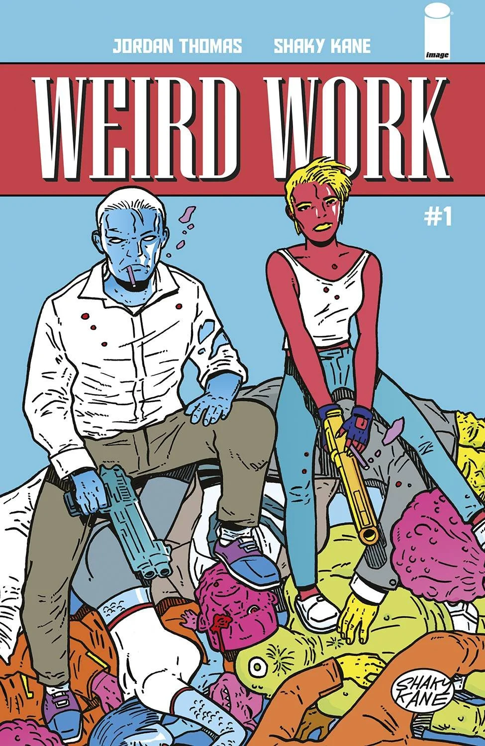
Weird is definitely a word that works for WEIRD WORK #1 from writer Jordan Thomas and artist Shaky Kane, which hit shelves this past week from Image Comics. The publisher billed the miniseries as a “crime epic” which combines “the hard-boiled noir of LA Confidential” and the “alien-filled worlds of Futurama.” It sounds enticing on the surface, but the delivery fell flat due to what felt like a contrived attempt to shock readers with an over-the-top approach to every element of the issue.
We’re thrown in the seedy criminal underworld of Stellar City, where the walls are closing in on a top crime boss who is believed to have ordered the hit on a foul-mouthed (literal pig) politician. Dead bodies pile up from early on, including the triple homicide which introduces us to our main characters — a detective with the shakes and his new partner with a shady past. The issues follows these two as they’re tasked with solving the crime and are an eclectic pairing to say the least.

Credit: Image Comics
There is an “in-your-face” approach to the writing that took a bit getting used to. Not to say I appreciated it by the end, but at least I understood the tone Thomas took throughout the book. There’s vulgarity, abrasiveness, and cynicism dripping from every character we meet. I wish there was as much time spent in giving these characters some depth as there was in trying to make them sound like gruff cops. The “introduction” to our main characters basically ended at learning their names and a few lines on their personal warts. They were one-note and lacked any level of complexity.
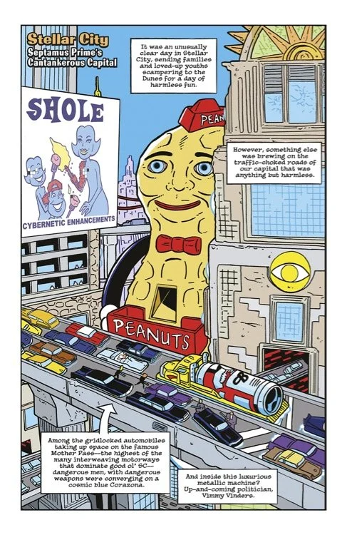
On the other hand, Kane’s artwork was beyond complex. There were so many different species on every page, that each change of scene could have been confused for a different story altogether. The artwork screams Kane through and through but it all felt cluttered. Some of the panels with wider shots of Stellar City had a vintage aspect to them that were intriguing, but that was about it for world-building throughout the entire book. Most panels were of random species filled with bullet holes. I will say the colors were fun though.
Credit: Image Comics
The lettering by LetterSquids did nothing to help the visual aspect of the comic. With Kane’s thick lines and obtuse characters, the serif fonts and large speech bubbles only added to some panels feeling claustrophobic. There are text boxes meant to be excerpts from a newspaper story that appear early in the book which were extremely off-putting due to the font choice.

Credit: Image Comics
WEIRD WORK #1 started to hit its stride by the end of the issue when the crime took center stage and our main duo began their investigation. If that’s the focus for the remaining issues, I could see this becoming an interesting story even with some of the pain points along the way. But this may be WORK I put off if Thomas and Kane go back to trying to “show” more than “tell” going forward.
Rating: 3/10